Introduction to Mobile UX Design
In today's digital landscape, mobile devices have become the primary means through which users interact with digital products and services. With over 6.8 billion smartphone users worldwide, creating exceptional mobile user experiences is no longer optional—it's essential for business success.
Mobile UX design focuses on creating intuitive, efficient, and enjoyable experiences for users on smartphones and tablets. Unlike desktop interfaces, mobile UX must account for smaller screens, touch interactions, varying contexts of use, and unique user behaviors.
 Global mobile usage continues to grow, making mobile UX a critical business consideration
This comprehensive guide will walk you through the fundamental principles, best practices, and strategies for creating mobile experiences that delight users and drive business results. Whether you're designing a new mobile app, optimizing an existing one, or creating a responsive website, these insights will help you craft more effective mobile interfaces.
Understanding the Mobile Context
Mobile users interact with their devices in vastly different contexts compared to desktop users. They might be walking, commuting, multitasking, or dealing with distractions. Understanding these contexts is crucial for designing appropriate experiences.
Key Differences Between Mobile and Desktop UX
Desktop Experience
- Larger screen real estate
- Precise cursor control
- Keyboard shortcuts available
- Typically stationary usage
- Consistent connectivity
- Extended session duration
- Multiple windows/tabs common
Mobile Experience
- Limited screen space
- Touch interaction (less precise)
- On-screen keyboard limitations
- Used while on the move
- Variable network conditions
- Shorter, more frequent sessions
- Single app focus
Mobile User Behavior Patterns
Research has identified several common patterns in how users interact with mobile devices:
- One-handed usage: Many users prefer to operate their device with just one thumb, limiting their reach on larger screens.
- Micro-moments: Brief, intent-driven sessions where users want to know, go, do, or buy something quickly.
- Attention fragmentation: Mobile users are frequently interrupted and may switch between tasks.
- Location awareness: Users expect mobile experiences to adapt to their current location and context.
- Immediate gratification: Mobile users have less patience and expect faster loading times and simpler interactions.
 Thumb zone heatmap showing comfortable, stretching, and hard-to-reach areas on a mobile screen
Pro Tip: Design for Interruption
Mobile users are frequently interrupted. Design your app to save states, provide clear re-entry points, and make it easy to resume tasks after interruption. Consider implementing auto-save features and progress indicators to reduce user frustration.
Core Principles of Mobile UX Design
1. Simplicity and Focus
Mobile interfaces should be focused on core functionality, eliminating unnecessary elements that can overwhelm users on small screens. Each screen should have a clear purpose and help users accomplish specific tasks efficiently.
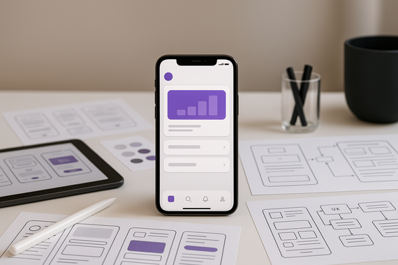
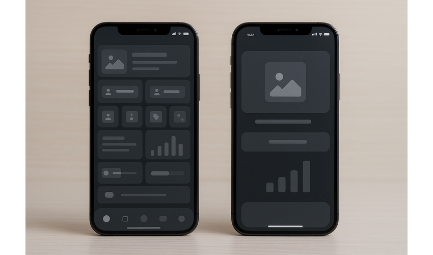 Simplified interfaces help users focus on key tasks and reduce cognitive load
2. Consistency and Standards
Follow platform-specific guidelines (iOS Human Interface Guidelines or Android Material Design) to create experiences that feel familiar to users. Consistency in navigation patterns, interaction methods, and visual elements helps users learn your interface more quickly.
3. Accessibility and Inclusivity
Design for users of all abilities by implementing proper contrast ratios, scalable text, voice control compatibility, and screen reader support. Accessible design benefits all users, not just those with disabilities.
4. Performance Optimization
Mobile users expect fast-loading apps and websites. Optimize images, minimize HTTP requests, implement lazy loading, and use appropriate caching strategies to ensure your mobile experience feels responsive even on slower connections.
5. Contextual Awareness
Leverage device capabilities like location services, cameras, and sensors to provide contextually relevant experiences that adapt to user circumstances and environment.
Pro Tip: Test on Real Devices
Emulators and simulators are useful, but they can't replicate the actual experience of using your app on a physical device. Test on various device types, screen sizes, and in different lighting conditions to identify usability issues that might not be apparent in controlled environments.
Designing for Touch Interactions
Touch is the primary input method for mobile devices, requiring special consideration in your design approach.
Touch Target Sizes
Touch targets should be large enough for users to tap accurately without hitting adjacent elements. Apple recommends a minimum target size of 44×44 points, while Google suggests 48×48 dp (density-independent pixels).
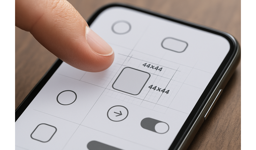 Properly sized and spaced touch targets improve interaction accuracy
Gesture Design
Common mobile gestures include:
- Tap: The most basic interaction for selecting items or activating controls
- Swipe: Used for scrolling, navigating between screens, or revealing actions
- Pinch/Spread: For zooming in and out of content
- Long press: Typically reveals contextual actions or additional information
- Drag: Used for moving items or adjusting controls
When implementing gestures, consider these guidelines:
- Use standard gestures that users already understand
- Provide visual cues for available gestures
- Include fallback methods for critical actions
- Avoid complex gesture combinations
- Test gestures with users to ensure discoverability
Designing for Different Hand Positions
Consider how users hold their devices and place important interactive elements within easy reach. The "thumb zone" concept helps identify comfortable interaction areas based on how users typically hold their phones.
Pro Tip: Provide Visual Feedback
Always provide immediate visual feedback for touch interactions. This includes state changes (pressed, selected), progress indicators for longer operations, and clear confirmation of completed actions. This feedback helps users understand that their input has been recognized.
Mobile Navigation Patterns
Effective navigation is crucial for mobile experiences, helping users find content and features without frustration.
Common Mobile Navigation Patterns
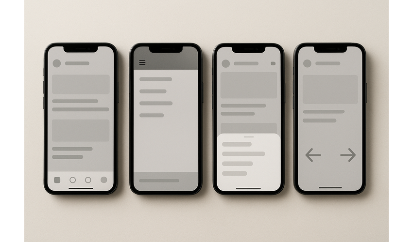 Common mobile navigation patterns: Tab bar, Hamburger menu, Bottom sheet, and Gesture-based navigation
- Tab Bar Navigation: Provides quick access to main sections of an app, typically displayed at the bottom (iOS) or top (Android) of the screen.
- Hamburger Menu: Conceals navigation options behind a menu icon, saving screen space but reducing discoverability.
- Bottom Sheet Navigation: Reveals navigation options by swiping up from the bottom of the screen.
- Gesture-Based Navigation: Uses swipes and other gestures to navigate between screens or sections.
- Floating Action Button (FAB): Provides quick access to the primary action on a screen.
Navigation Best Practices
- Prioritize the most important destinations in your primary navigation
- Limit navigation depth to 3 levels when possible
- Provide clear back navigation and home access
- Use descriptive labels for navigation items
- Maintain consistency in navigation patterns throughout the app
- Consider implementing a search function for content-heavy apps
Pro Tip: Prioritize Visibility
While hamburger menus save space, research shows they can reduce engagement with navigation options. Consider using a tab bar for critical destinations and reserving hidden menus for less frequently accessed features.
Typography and Readability
Text legibility is particularly challenging on mobile devices due to smaller screens and variable viewing conditions.
Mobile Typography Guidelines
- Font size: Use a minimum of 16px for body text. Headings should scale proportionally.
- Line height: Set line height to 1.4-1.5 times the font size for optimal readability.
- Line length: Aim for 30-40 characters per line to prevent eye strain.
- Font choice: Select fonts designed for screen readability. System fonts like San Francisco (iOS) and Roboto (Android) are optimized for mobile displays.
- Contrast: Maintain a contrast ratio of at least 4.5:1 between text and background for standard text, and 3:1 for large text.
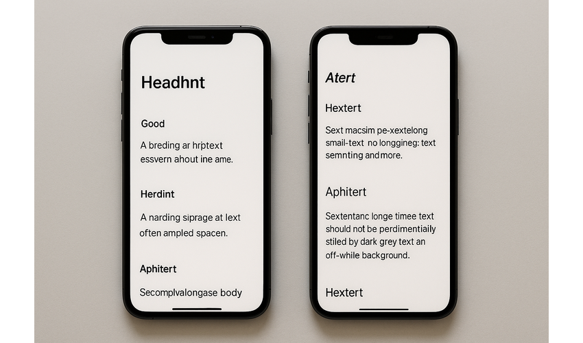 Examples of effective and problematic mobile typography
Content Structure for Mobile
Structure content for mobile consumption by:
- Using clear hierarchical headings (H1, H2, H3)
- Breaking content into short, scannable paragraphs
- Employing bulleted lists for easier scanning
- Highlighting key information with bold text (sparingly)
- Placing the most important information at the beginning
Pro Tip: Test in Different Lighting
Mobile devices are used in various lighting conditions, from bright sunlight to dark rooms. Test your typography in different environments to ensure it remains readable across all conditions.
Form Design for Mobile
Forms are often conversion points in mobile experiences, but they can be particularly challenging on small screens with virtual keyboards.
Mobile Form Best Practices
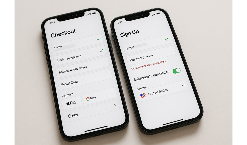 Effective mobile form design patterns that reduce user friction
- Minimize form fields: Only ask for essential information. Each additional field reduces completion rates.
- Use appropriate input types: Set the correct keyboard type for each field (email, phone, number, etc.).
- Implement autofill: Enable browser autofill functionality to speed up form completion.
- Show validation in real-time: Provide immediate feedback on field completion rather than waiting until submission.
- Use single-column layouts: Avoid multi-column forms that can cause confusion on small screens.
- Provide clear error messages: Error messages should be specific, helpful, and positioned near the relevant field.
- Consider alternative inputs: Use toggles, sliders, and selection lists instead of text input when appropriate.
Optimizing Checkout Forms
For e-commerce and conversion-focused forms:
- Break long forms into logical steps with progress indicators
- Offer guest checkout options to reduce initial friction
- Implement address lookup functionality to reduce typing
- Support digital wallets and payment services (Apple Pay, Google Pay)
- Save user information for returning customers
Pro Tip: Test with the Virtual Keyboard
Always test your forms with the virtual keyboard visible to ensure fields aren't obscured and that users can easily navigate between inputs. Consider implementing automatic scrolling to keep the current field in view.
Performance Optimization
Performance is a critical aspect of mobile UX. Slow-loading apps and websites lead to abandonment and frustration.
Key Performance Metrics
- First Contentful Paint (FCP): Time until the first content appears on screen
- Time to Interactive (TTI): When the page becomes fully interactive
- Input Latency: Delay between user action and interface response
- Frame Rate: Smoothness of animations and scrolling (aim for 60fps)
- Memory Usage: How efficiently the app uses device memory
Performance Optimization Strategies
- Image optimization: Compress images, use appropriate formats (WebP, AVIF), and implement lazy loading
- Code splitting: Load only the necessary code for each screen
- Minimize network requests: Bundle resources and reduce API calls
- Implement caching: Cache resources to reduce loading times for returning users
- Optimize animations: Use hardware acceleration and limit complex animations
- Reduce JavaScript execution time: Optimize code and defer non-critical scripts
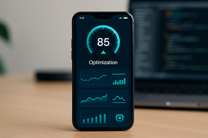
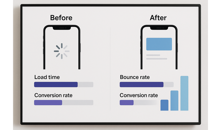 Performance improvements can significantly impact user experience and conversion rates
Perceived Performance
Beyond actual performance, consider techniques to improve perceived performance:
- Use skeleton screens instead of spinners during loading
- Implement progressive loading of content
- Provide immediate feedback for user actions
- Pre-fetch likely next actions or content
- Optimize the critical rendering path for faster visual completeness
Pro Tip: Test on Mid-Range Devices
Don't just test on the latest flagship devices. Most users worldwide use mid-range or older smartphones. Testing on these devices will help you identify performance issues that might affect a significant portion of your user base.
Platform-Specific Design Considerations
While many UX principles apply across platforms, iOS and Android have distinct design languages and user expectations.
iOS vs. Android Design Patterns
iOS Design Patterns
- Tab bars at the bottom of the screen
- Navigation bars with back button on left
- Modal sheets that slide up from bottom
- San Francisco as the system font
- Translucent, blurred backgrounds
- Emphasis on white space and minimalism
- Swipe back gesture for navigation
Android Design Patterns
- Bottom navigation or navigation drawer
- Up button in top-left for navigation
- Material Design components
- Roboto as the system font
- Use of elevation and shadows
- Floating Action Button (FAB)
- More use of color and visual hierarchy
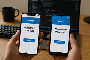
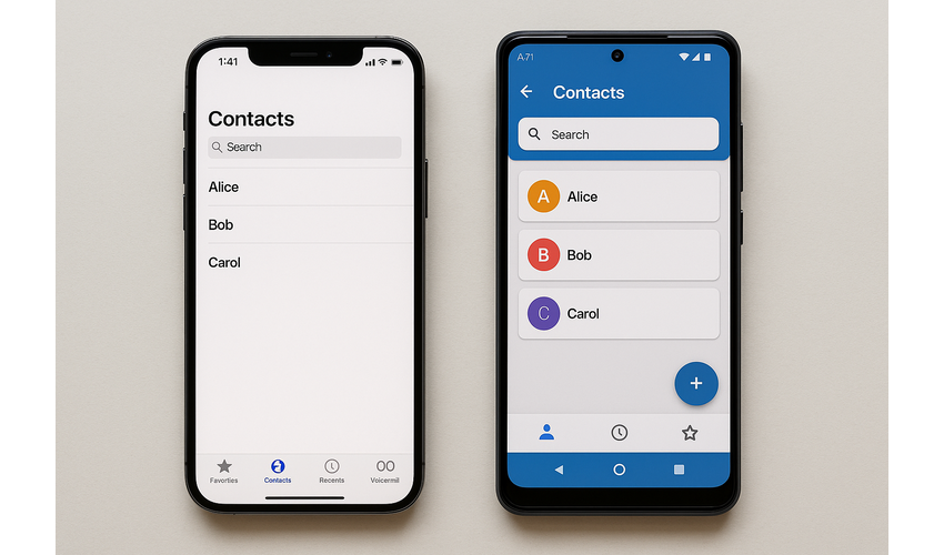 iOS and Android have distinct design languages that users are accustomed to
Approach to Platform Design
When designing for multiple platforms, consider these approaches:
- Platform-specific design: Create separate designs that follow each platform's guidelines closely
- Adaptive design: Maintain your brand identity while adapting key interaction patterns to each platform
- Unified design: Use a consistent custom design language across platforms (may feel less native but provides brand consistency)
Pro Tip: Respect Platform Conventions
Even if you choose a unified design approach, respect fundamental platform conventions for navigation and core interactions. This reduces the learning curve for users and makes your app feel more intuitive on each platform.
Testing Mobile UX Design
Thorough testing is essential to identify usability issues and validate design decisions.
Mobile UX Testing Methods
- Usability testing: Observe real users completing tasks on your mobile interface
- A/B testing: Compare different design variations to determine which performs better
- Analytics review: Analyze user behavior data to identify pain points and drop-offs
- Heatmap analysis: Visualize where users tap, scroll, and focus attention
- Accessibility testing: Ensure your design works well with assistive technologies
- Performance testing: Measure loading times and interaction responsiveness
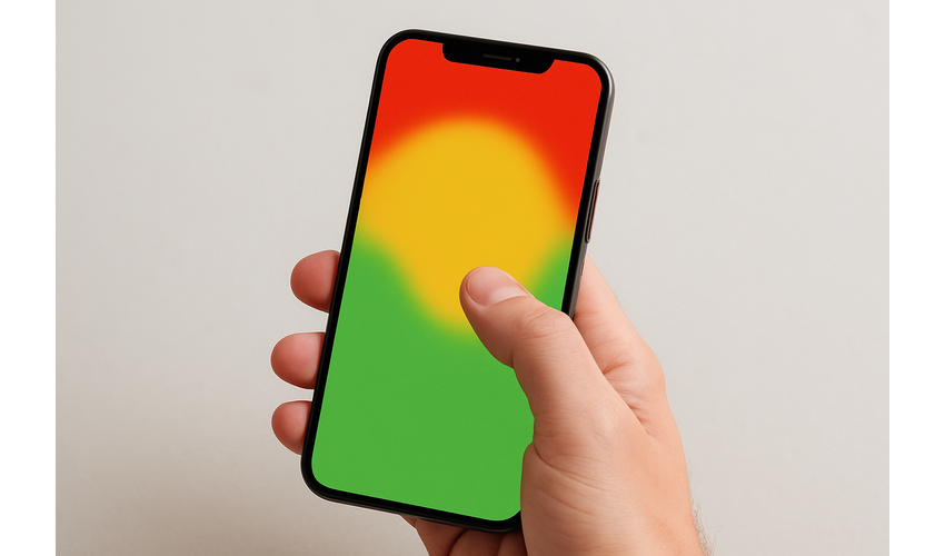
 Observing real users interact with your mobile interface provides invaluable insights
Mobile Testing Checklist
When testing mobile experiences, verify:
- All interactive elements are large enough to tap accurately
- Content is readable without zooming
- The interface works in both portrait and landscape orientations (if supported)
- The app performs well on various device types and screen sizes
- Forms and input fields work properly with the virtual keyboard
- The interface adapts appropriately to different screen sizes
- The app works in different network conditions (including offline if applicable)
- All gestures and interactions are intuitive and discoverable
Pro Tip: Test in Context
Whenever possible, conduct testing in environments that match how users will actually use your app—on public transport, walking, in bright sunlight, or with distractions. Context significantly impacts mobile usability.
Free Mobile UX Design Resources
Download our collection of mobile UX design resources, including templates, checklists, and wireframe kits to accelerate your design process.
Download Resource Pack
Conclusion: Creating Exceptional Mobile Experiences
Creating outstanding mobile user experiences requires a deep understanding of user contexts, careful attention to platform-specific guidelines, and a commitment to performance and accessibility.
By focusing on simplicity, designing for touch, optimizing performance, and thoroughly testing your designs, you can create mobile experiences that not only meet user needs but exceed their expectations.
Remember that mobile UX design is an iterative process. Continuously gather user feedback, analyze behavior data, and refine your designs to improve the experience over time.
At Aries Star Marketing OPC, we specialize in creating exceptional mobile experiences that drive engagement and conversion. If you need assistance with your mobile app or responsive website design, our team of UX experts is ready to help.